Preliminary task
The preliminary task was to create a college magazine to test how good my media skills were.
The task below was to see how good my photo shop skills were

|

|

From what the man on the cover of the Indiana Jones movie poster is wearing i would assume that he is an adventurer because the clothes that he is wearing are the clothes that you would associate with an explorer and plus the belt that he is wearing would also make me think he is an explorer as it looks like there are tools on it, all of those things would make me believe that tis is an adventre
film.
I thought that the props used in the poster were used to good effect like the whip that man is holding in his hands i thought that could of been there to represent the characters bravery and strength as whips
are commonly associated with taming wild and powerful beasts and the huge skull in the background which connotes death all make this film seem as if its an action film.
The setting in this poster looks like an ancient temple which i think adds to theme of adventure and
mystery.
The lighting used on the poster is really bright towards the top where the skulls and the mans face and upper body is and gets darker as it comes down I think that this could represent their importance to the story
The non verbal communication used by the man on the cover would suggest that this is a serious film because the man is standing
upright, his fists are clenched, he has a serious expression on his face and his eyes seem to be fixed and focused on a target all of those aspects would give you the idea that this is serious and non humourous film.
However, the anchorage of the first part of the title suggests that it isn't such a serious film because the font is kind of childish one that you would see in a comic book and the second part of the text looks kind of futuristic
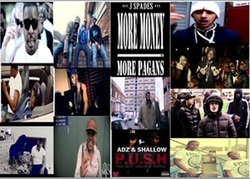
I made my music mood board around the genre “Grime” which really is an underground genre as not that many people know about, I would describe it as a faster and a more creative version of Rap. So on my mood board are some of my favourite grime artists, memorable moments, famous quotes and album covers.
Grime was created in North London a few years backmaking it quite popular with teenaged Londoners it’s a genre that is heavily dominated byblack people, normally on a Grime track the artist would tell a story e.g. apast fight or how they are going to get rich. A lot of people think
that Grimeis a violent genre mainly because In the past Grime has been used to pass on threats or to show a gangs dominance which gives people misconception that all grime is violent and promotes crime which is not true as some artist talk about inspirational things like becoming successful in their goals.
existing college magazine

On the cover of the college lifestyle magazine There is a black person who is dressed in nice and casual clothes which tells us that he is a young and stylish person but he has a lot of neat facial which makes him look mature and sensible, he is holding books one titled “law, business and society”which automatically tells us that he is a student studying at a college, his non-verbal communication tells us that he is enjoying his time at college as he is smiling , the setting of the photo doesn’t really tell us anything because the background is plain but the background has really low key lighting at the top and bottom of the page but when as it gets closer to the person’s face the background gets brighter which could connote that he has a bright future or he Is a revolutionary figure of some kind or maybe he is a figure of inspiration towards the other students in the college.
The masthead is in two parts the first part has the word “college” in big font and bright yellow letters which really clashes with the black background could connote happiness,summer and excitement and in the second part is the word “lifestyle” in a duller thin and grey font which could connote relaxation the cover lines on the cover are either in yellow or white which really stand out from the background and they are all about things their target audience (people that go to college / teenagers) would find exciting or interesting for example “make money on campus” and “thank god it’s Friday Kingston’s hottest night spot” which are all things that would appeal to their target audience, their selling line is “your exclusive guide to everything hip hot and happening” I think that would appeal to their target audience because teenagers would want to constantly be up to date with what is cool or stylish so I think this is an effective selling line and next to that is the date line in yellow but it doesn’t really stand out maybe because it is was not that important to the creator of the magazine the first part of the main cover line says “Dance Hall’s Bright Future” in bright and big yellow font and then the second part says “Jeffrey assassin Campbell” in a duller grey and thin font which looks like it is introducing the young man on the cover of the magazine the puff on the cover of college lifestyle magazine looks like a pink blob of paint with white writing which says “lets go paint balling” which I thought would be effective because paint balling is an activity that all young people would like to take part in so I think that would attract a lot of attention and then in the bottom left corner of the cover are the price and the barcode which in my opinion make the magazine look more professional
The masthead is in two parts the first part has the word “college” in big font and bright yellow letters which really clashes with the black background could connote happiness,summer and excitement and in the second part is the word “lifestyle” in a duller thin and grey font which could connote relaxation the cover lines on the cover are either in yellow or white which really stand out from the background and they are all about things their target audience (people that go to college / teenagers) would find exciting or interesting for example “make money on campus” and “thank god it’s Friday Kingston’s hottest night spot” which are all things that would appeal to their target audience, their selling line is “your exclusive guide to everything hip hot and happening” I think that would appeal to their target audience because teenagers would want to constantly be up to date with what is cool or stylish so I think this is an effective selling line and next to that is the date line in yellow but it doesn’t really stand out maybe because it is was not that important to the creator of the magazine the first part of the main cover line says “Dance Hall’s Bright Future” in bright and big yellow font and then the second part says “Jeffrey assassin Campbell” in a duller grey and thin font which looks like it is introducing the young man on the cover of the magazine the puff on the cover of college lifestyle magazine looks like a pink blob of paint with white writing which says “lets go paint balling” which I thought would be effective because paint balling is an activity that all young people would like to take part in so I think that would attract a lot of attention and then in the bottom left corner of the cover are the price and the barcode which in my opinion make the magazine look more professional
My attempt
Front cover

I decided to call my magazine "College Movements" because i wanted my magazine to be one that outlines the acheivements of students and the latest gossip going around the college. My target audience are the people who go to the college (teenagers). Dark blue and grey were the colours which featured heavily on my front cover mainly because i thought that they were cool and calm colours which suits the style of my magazine. I used this picture because i thought that it went well with the headline and i used these cover lines because i thought that they would catch the eye of most teenagers.
contents page

I used this layout for my Contents Page because I thought it looked neat and professional. I liked how my colour scheme came out on the black background I thought it looked cool. I put an editors note saying "thank you" to my readers and telling them that I appreciate them so that they buy future copies of my magazine
